Week 3
Sociology 106: Quantitative Sociological Methods
February 3, 2026
Housekeeping
Weekly assignments
Due on Thursdays nights (except for hw1 )
Generally, if a couple of things not quite right → still full credit. If more than a couple → half credit
Each assignment is only 3% of your grade, and lowest grade over the course of the semester is dropped
But, multiple assignments not turned in will negatively affect your grade!
HW #1: due Tuesday, February 10, 11:59 PM – Extended deadline - any questions?
HW #2: due Thursday, February 12, 11:59 PM
Learning goals
Identify and distinguish between different variable types (ratio, interval, ordinal, nominal)
Create and customize appropriate figures for different data types using ggplot2
Evaluate which visualization methods best communicates specific data patterns
Start thinking about where to get data for final paper
Agenda
Finish lab from last week
Getting data to use in future weekly assignments and your final paper
Visualizing data using ggplot
Weekly assignments example
Begin paper proposal discussion
Finish Lab #1
Let’s jump back in to Lab #1:
Open soc106/labs/lab1.qmd
Decide if you want to use Source or Visual to interact with the script
What type of data?
We want data that will help us say something about sociological theories / social processes
This encompasses a wide variety of data!
Our observations can be individuals, groups/organizations, countries
We will want to focus on topics that sociologists care about
But, fortunately for you, we care about almost everything!
Not sure if your data source/topic is appropriate?
Feel free to ask!
Getting data: online repositories
Online repositories contain multiple datasets, and you can generally search for datasets related to your topic of interest
Features:
Some repositories need a UC Berkeley login
Some repositories allow you to do some data analysis on the webpage without accessing the raw data
For this class : we will want to download the raw data and work with it in R (importing it from .csv or from another data type if necessary)
Visualizing data
Most important first step in analyzing data is to take a close look at the data itself
An easy way to take a close look at the data is to visualize it with a figure:
How variables are distributed—that is, what values our variables have across all observations
How the values of variables change over time
How the values of one variable are related to the values of another variable
Review: levels of measurement
Four common levels of measurement we use in data analysis.
Ratio True zero point
Age, income, years of education
Continuous
Interval Equal distances, no true zero
IQ, SAT scores, SES
Continuous
Ordinal Ordered categories
Letter grades, liberal-conservative
Categorical
Nominal Unordered categories
Gender, religion, political party
Categorical
Why this matters: How we visualize a variable depends on its level of measurement
Basics of a ggplot plot
ggplotdata , mapping , and layers . Let’s look at an example:
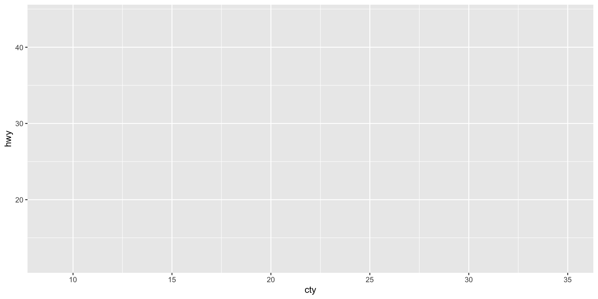
Start with your dataframe and ggplot(). This creates an empty canvas.
Add aes() to connect columns to visual properties (x, y, color). Now we have axes.
ggplot (mpg, aes (x = cty, y = hwy))
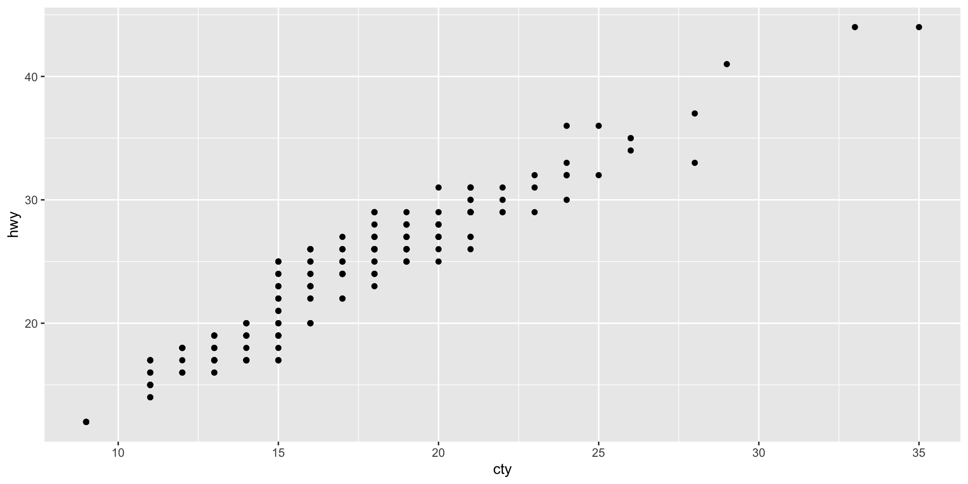
Add a geom_point() to display the data as points. Use + to add layers.
ggplot (mpg, aes (cty, hwy)) + geom_point ()
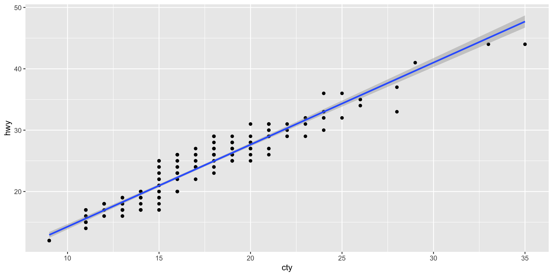
Add a geom_smooth() to run a regression line through the points
ggplot (mpg, aes (cty, hwy)) + geom_point () + geom_smooth (formula = y ~ x, method = "lm" )
Visualizing variables
Which data visualization should you use with which combinations of variables?
1 Categorical
Bar chart
1 Continuous
Histogram, Density plot, Box plot
2 Continuous by Continuous
Line chart (over time)
2 Continuous by Continuous
Scatterplot
2 Continuous by Categorical
Boxplot
Bar charts: geom_bar()
For categorical (nominal or ordinal) variables, we can visualize their distribution in a dataset using a bar chart.
A graph of a frequency table
Height of bars indicates the relative frequency of values in our dataset
X axis : a series of categoriesY axis : absolute frequency of valuesWe can do this using the geom_bar() function
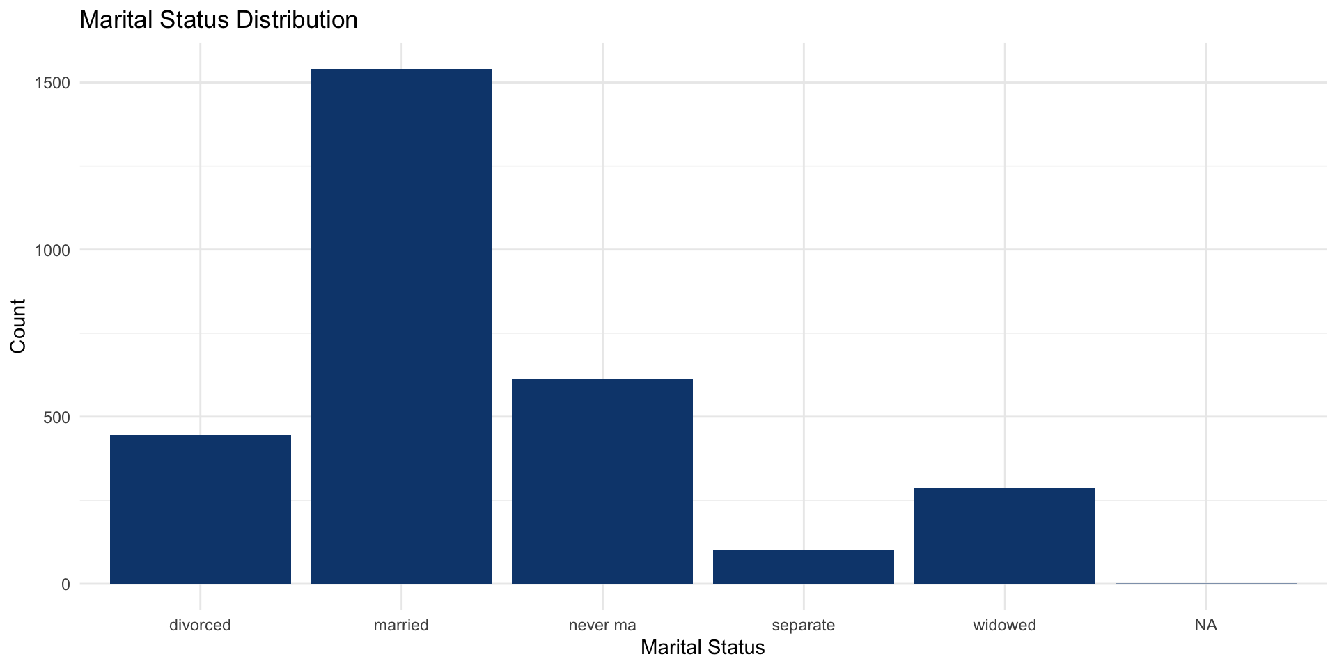
Frequency of marital status in attain:
ggplot (data = attain, aes (x = marital)) + geom_bar (fill = "#0d467cff" ) + labs (title = "Marital Status Distribution" ,x = "Marital Status" ,y = "Count" + theme_minimal ()
Histogram: geom_histogram()
For continuous (interval or ratio) variables, we can visualize their distribution in a dataset using a histogram .
A graph in which a continuous variable is divided into categorical values
Frequencies shown in a bar graph
We can do this using the geom_histogram() function
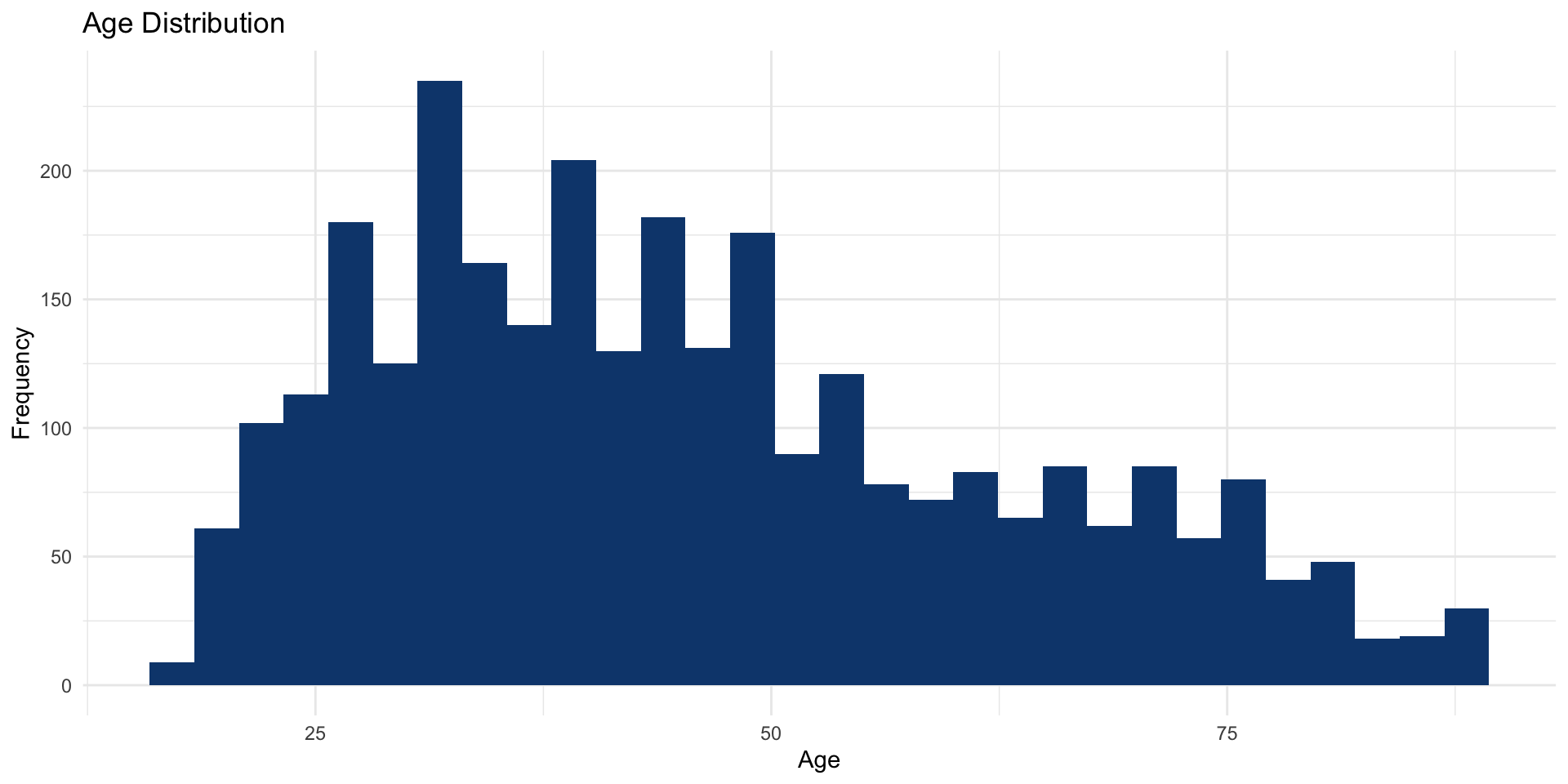
R will automatically ‘bin’ a continuous variable into groups and then plot their frequency.
It defaults to 30.
ggplot (data = attain, aes (x = age)) + geom_histogram (fill = "#0d467cff" ) + labs (title = "Age Distribution" ,x = "Age" ,y = "Frequency" + theme_minimal ()
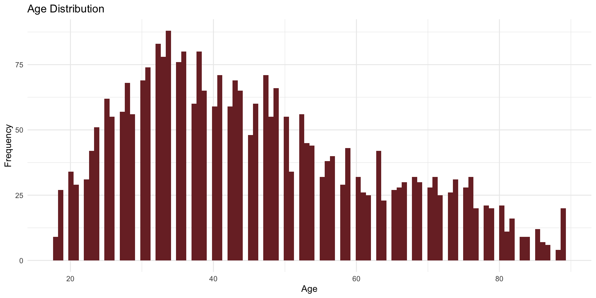
You can override geom_histogram()’s default by specifying the number of bins(). Here we set it to 100.
ggplot (data = attain, aes (x = age)) + # set bins to 100 geom_histogram (bins = 100 , fill = "#7B2C2F" ) + labs (title = "Age Distribution" ,x = "Age" ,y = "Frequency" + theme_minimal ()
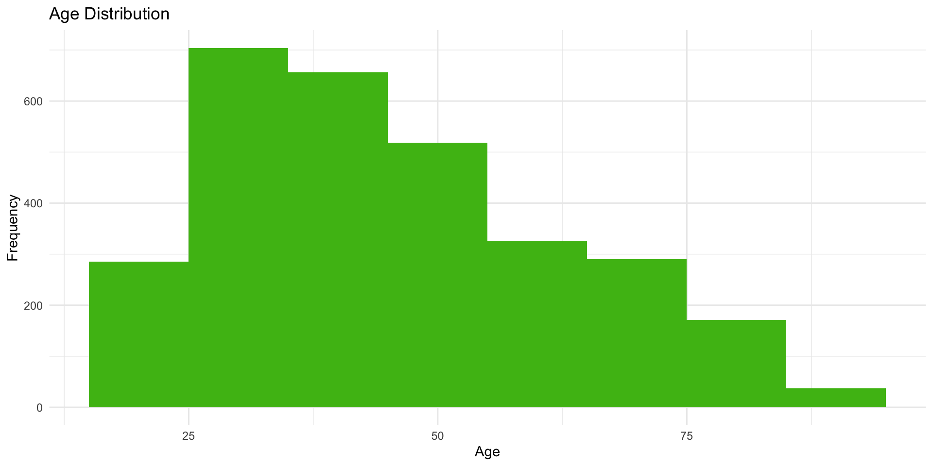
Alternatively, you can make the bins wider to include more observations. Here, we set the binwidth = 10, which makes the bins span 10 units.
ggplot (data = attain, aes (x = age)) + # set binwidth to 10 geom_histogram (binwidth = 10 , fill = "#4CBB17" ) + labs (title = "Age Distribution" ,x = "Age" ,y = "Frequency" + theme_minimal ()
Line chart: geom_line()
A line chart is similar to a bar graph but the tops of the bars are represented by points joined by lines.
X and Y variables are ordered in some way (ordinal, interval, ratio)
Most useful to show change in a Y variable over your X variable
May not work well with missing values
We can do this using the geom_line() function
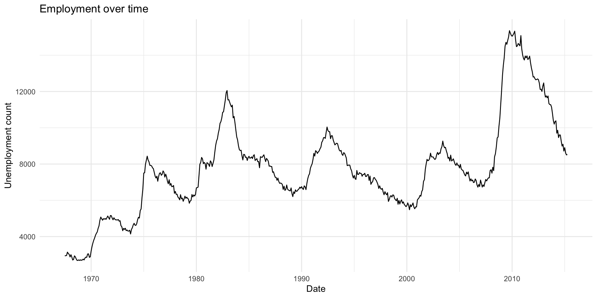
Here’s a look at unemployment rates over time. Note that if we have data where we have average values of Y for ordered values of X, we can also use line charts.
|> ggplot (aes (x = date, y = unemploy)) + geom_line () + labs (title = "Employment over time" ,x = "Date" ,y = "Unemployment count" + theme_minimal ()
Scatterplot: geom_point()
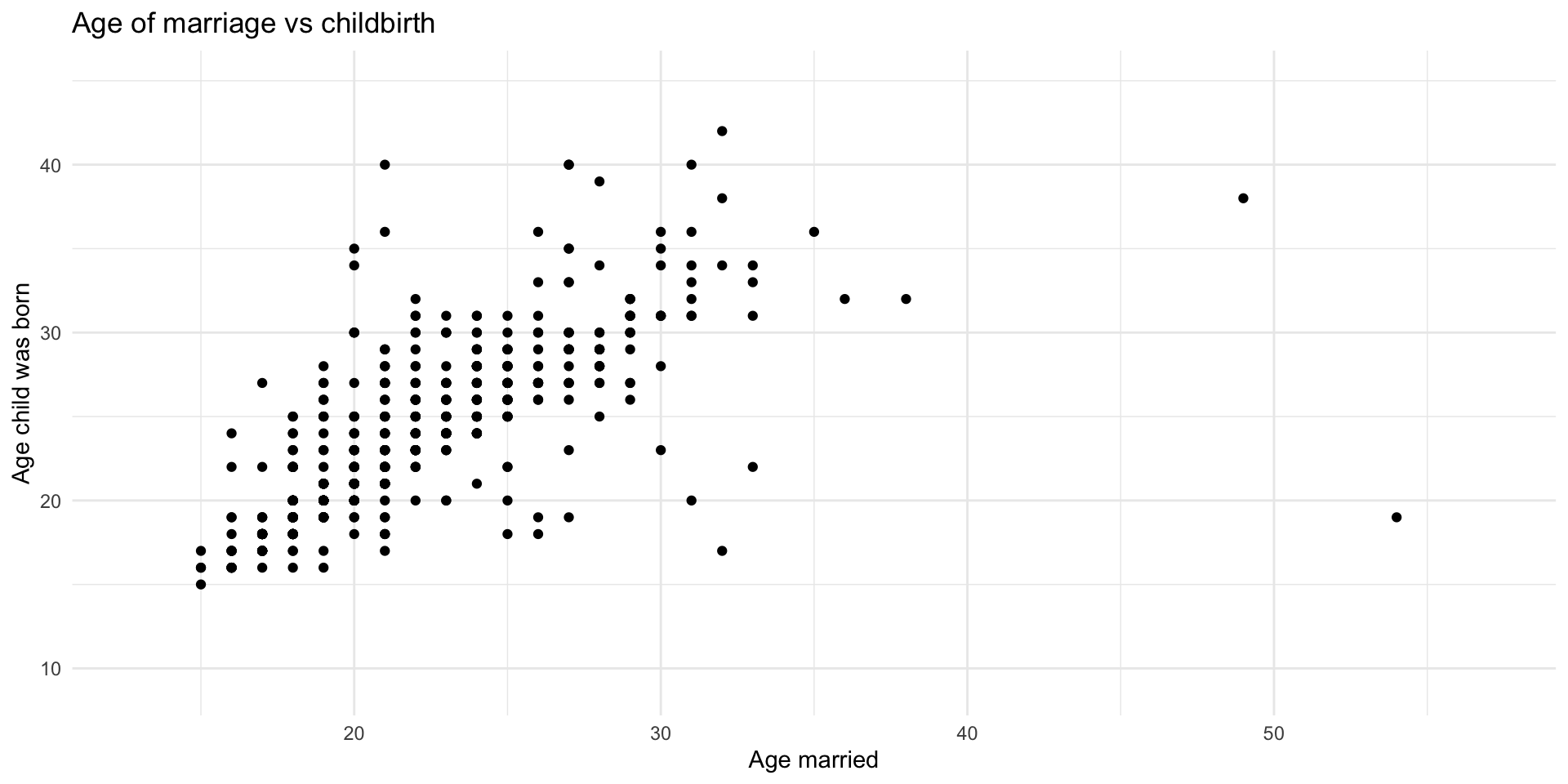
A scatterplot is a two-dimensional rectangular plot for visualizing the relationship between two continuous variables.
X-axis : values of one continuous variableY-axis : values of another continuous variableWe can do this using the geom_point() function
Let’s look at the relationship between the age at which an individual was married and the age when their child was born.
|> ggplot (aes (x = agewed, y = agekdbrn)) + geom_point () + labs (title = "Age of marriage vs childbirth" ,x = "Age married" ,y = "Age child was born" + theme_minimal ()
Boxplot: geom_boxplot()
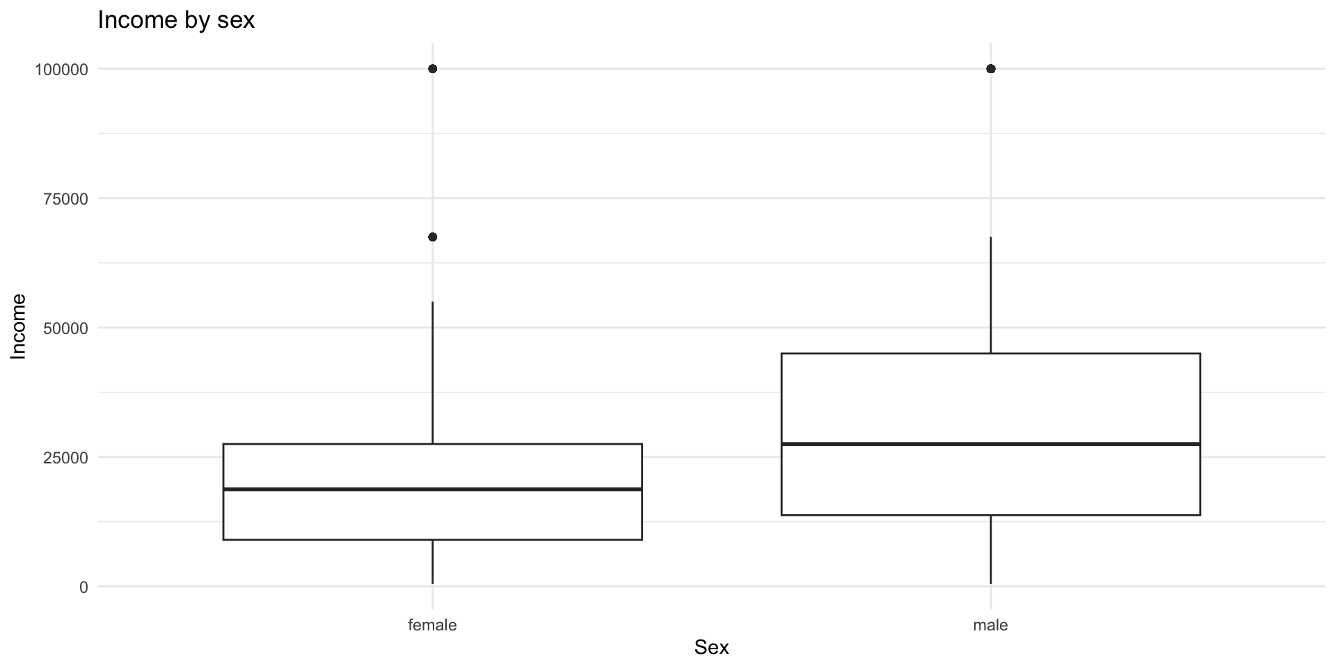
The boxplot compactly displays the distribution of a continuous variable, usually by a categorical one. It visualises five summary statistics (the median, 25th and 75th percentile form the box), and all “outlying” points individually.
Most useful to see the entire distribution of a variable, by another categorical one
Most useful looking at 2 vars
We can do this using the geom_boxplot() function
In this case, we are looking at the distribution of income by sex.
|> ggplot (aes (x = sex, y = rincom91)) + geom_boxplot () + labs (title = "Income by sex" ,x = "Sex" ,y = "Income" + theme_minimal ()
Weekly Assignment Example
You’ll be provided a hw#.qmd each week that you’ll use as a template to complete your homework assignment. It will be available in bCourses under the “Assignments” folder for that week
Some weeks you’ll just answer specific questions, but in weeks that require you to use your own data, you’ll approach the assignment like a research paper, which you can use to build into the final paper.
Let’s look at an example to better understand what I’m asking.
Weekly Assignment #2
Assignment:
Using a dataset of your choice, choose a research question and construct a plot that helps answer it.
HW #2: due Thursday, February 12, 11:59 PM
Paper Proposal (5%)
A two-page double-spaced proposal for your final paper is due on bCourses by Thursday, February 26 at 11:59 PM . Here’s an example .
Your proposal should include:
Research question - What are you trying to answer?Why it matters - Why should we care about this question?Hypotheses - What do you think the answer is, and why?Data source - What dataset will you use?Key variables - Identify your independent and dependent variables
Note: You do not need to discuss statistical techniques at this point.